Showing posts with label Erle Stanley Gardner. Show all posts

Sunday, 20 November 2022

Pan’s People:
The Case of the Velvet Claws
by Erle Stanley Gardner
(1960)


Finishing off our recent celebration of Pan’s late ‘50s / early ‘60s cover artwork, here’s another absolute banger from Sam ‘Peff’ Peffer.

I don’t have much else to say, as my interest in the work of Erle Stanley Gardner extends precisely as far as the cool cover design which sometimes graces his books [see previous examples: 1, 2, 3], so instead let’s just say: wow, look at that dissolving big city skyline and the faceless guy in the shadows… no doubt knocked out under a tight deadline in a matter of minutes, this is pulp craftsmanship at its finest.

Wednesday, 9 March 2016

Pan-demonium.

 Following this 2014 post on the work of paperback cover artist Sam “Peff” Peffer, I’ve become quite interested in expanding my collection (and appreciation) of Pan paperbacks.

With their preference for colourful oil paintings bluntly depicting events within the book, Pan’s old-fashioned approach to cover illustration was the polar opposite of the modernist, design-based aesthetic of their rivals at Penguin, seemingly reflecting the fact that they tended to publish a far higher quantity of war stories, British Empire yarns and other such ‘square’ subjects, with just the occasional revered author or hot-headed literary turk thrown in for good measure.

Even in terms of the latter (with writers such as Alan Sillitoe), Pan seemed always to stay pretty ‘down to earth’ in comparison to their competitors. It’s certainly difficult to imagine anything terribly experimental finding a home between their covers during the ‘50s and ‘60s, and they rarely indulged in much science fiction. (Trying to imagine what the bloody hell their stable of cover artists might have made of a William Burroughs or Philip K. Dick book could definitely lead you to a few sleepless nights.)

Admittedly, they did move with the times and get a bit ‘psychedelic’ toward the end of the ‘60s with stuff like the Adam Diment books, but it always feels like a bit of a grudging acceptance of modernity, and, as a result, Pan’s output remains far less collectable and less rarely celebrated than that of Penguin, even though their design and illustrations are often very good, with a great deal of charm.

The bold, brightly coloured, no-nonsense paintings (kind of like the best of American pulp paperback arworkt, but with any hint of sex or sleaze surgically removed), the bold, upper-case block lettering, black spines and that distinctive yellow logo…. since I rearranged my book shelves last year and put all the Pans in one place, they really stand out, giving me an itch to acquire more. As such, some of my more recent finds are shared below.


(1960, cover art by Glenn Stewert)

A grand old man of BBC radio productions, Charles Chilton (1917-2013) wrote ‘Journey Into Space’ as a series of radio dramas between 1953-58, subsequently adapting them into a trilogy of novels, published in Pan between ’58 and ’62. See the above wiki links for as much information as you could possibly wish to know on these subjects.

Though he has a nice clear signature, Google turns up nothing on cover artist Glenn Stewert.


(1968, cover designer unknown)

The better looking entries in the Horror Stories series are probably about as close to ‘iconic’ cool as Pan paperbacks get, and this is definitely one of my favourites. As is often the case with Pan - great fonts.


(1952, cover artist unknown)

I don’t know anything about this one, and can’t read the artist’s signature, but it’s quite lovely isn’t it? Quite abstract by Pan standards.


(1957, cover by Rex Archer)

With no slight intended to ‘Rex’, you’d think they’d have gone with something a bit more.. classy for Hemingway, but what the hey, I like it. Kind of reminds me of an old Indian movie poster or something. As someone appears to written above the title of my much abused copy: ‘potent’.


(1962, cover by ‘Michel’?)

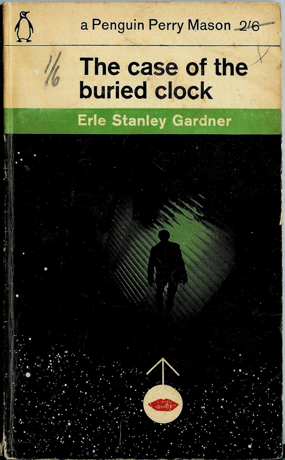
Because you can’t get to the end of a cover art gallery without a bit of Erle Stanley. This isn’t one of the more lively crime covers in my collection, but for connoisseurs might like to note that the spine is killer - really jumps off the shelf.


And finally, scribbled on back inside cover of ‘The Case of the Runaway Corpse’, we find one of those curious oddities that occasionally turn up to hint at a book’s past life – in this case, rough notes for a letter decrying the excessive expense and loudness of a new church organ, apparently.

Wednesday, 29 August 2012

Penguin Crime Week:
The Case of the Sleepwalkers Niece
by Erle Stanley Gardner
(1963)

(Cover uncredited, but probably the work of Romek Marber.)

I realise I’ve been slacking off my book cover blogging duties recently, but my new acquisitions has been multiplying relentlessly this summer, so time to get back into the swing of things, beginning with a few posts dedicated to those immaculate, green-hued hipsters of the genre fiction shelves, Penguin Crime.

First off, yet another cooler-than-it-likely-has-any-right-to-be Perry Mason cover that gets me wondering whether Penguin’s adoption of the distinctive green colour scheme was inspired in some obscure fashion by the way in which yellow/giallo became so synonymous with the crime genre in Italy. Probably not, but y’know, it’s a thought.

Sunday, 2 October 2011

Recent Paperback Acquisitions # 3:
Crime.


(Dell, 1961)

Robert McGinnis cover, first printing, good condition = £2. Eat my dust! (Or fail to give a damn and live a healthy & rewarding life… your choice.)


(Penguin Crime, 1958)


(Corgi, 1960)

Bertha Cool = best detective name ever.


(Gold Medal, 1960)

Why did I not know there was an early ‘60s TV show in which John Cassavetes played a hep-cat Greenwich Village Private Eye…?


(Lancer, 1973)

And a little bit of smut to finish off with:


(Kozy, 1961)

Tuesday, 15 June 2010

The DA Breaks An Egg
by Erle Stanley Gardner

(Total, 1973, originally published 1956)


More pop art awesomeness here, with a real stunning title/illustration/design combo, serving to make a creaky old Erle Stanley Gardner mystery look a damn sight groovier than I assume it to actually be.

For the sake of metaphoric continuity, poetic justice etc, I hope the book ends with the DA enjoying a nice omelette… in the prison canteen.

Interestingly, this volume contains almost no publication info whatsoever, aside from a simple copyright and year of printing, and correct me if I’m wrong, but isn’t that “Total Special Edition” thing on the front the logo of the oil company Total? A brief google search fails to shed any light on what the hell they were up to repackaging old crime books in the early ‘70s. There's no price on the back either, so I'm guessing it might have been a giveaway as part a promotion or something..? Who knows.


Beyond the fact that it’s a really cool and distinctive piece of artwork, this cover illustration particularly leapt out at me because I’ve seen it before: on the front of the British psychedelic pop compilation Voyage Through The Sugarcube, a record I’ve been vaguely looking for on vinyl for ages simply because I like the cover art so much.


As you can see, the people behind the LP have retouched it all slightly (or at least, drawn over the lines in Microsoft Paint or something), and have given the girl a bit more of a right hand.

It’s strange isn’t it, that seeing this image on the front of a crime book, we instantly assume GIRL = DEAD, whereas looking at the exact same picture on the front of an album, I’ve always seen her as dancing, or enjoying some kind of music-inspired freak-out. I thought at first that they'd redrawn the facial features on the record cover to aid that impression, but on closer inspection they're pretty much identical.

It’s a brilliant bit of pop-art imagery either way, and given the total lack of info on the book and the grey-market nature of the LP, I guess we can take it as being pretty much public domain, so please, spread it around!