With their preference for colourful oil paintings bluntly depicting events within the book, Pan’s old-fashioned approach to cover illustration was the polar opposite of the modernist, design-based aesthetic of their rivals at Penguin, seemingly reflecting the fact that they tended to publish a far higher quantity of war stories, British Empire yarns and other such ‘square’ subjects, with just the occasional revered author or hot-headed literary turk thrown in for good measure.
Even in terms of the latter (with writers such as Alan Sillitoe), Pan seemed always to stay pretty ‘down to earth’ in comparison to their competitors. It’s certainly difficult to imagine anything terribly experimental finding a home between their covers during the ‘50s and ‘60s, and they rarely indulged in much science fiction. (Trying to imagine what the bloody hell their stable of cover artists might have made of a William Burroughs or Philip K. Dick book could definitely lead you to a few sleepless nights.)
Admittedly, they did move with the times and get a bit ‘psychedelic’ toward the end of the ‘60s with stuff like the Adam Diment books, but it always feels like a bit of a grudging acceptance of modernity, and, as a result, Pan’s output remains far less collectable and less rarely celebrated than that of Penguin, even though their design and illustrations are often very good, with a great deal of charm.
The bold, brightly coloured, no-nonsense paintings (kind of like the best of American pulp paperback arworkt, but with any hint of sex or sleaze surgically removed), the bold, upper-case block lettering, black spines and that distinctive yellow logo…. since I rearranged my book shelves last year and put all the Pans in one place, they really stand out, giving me an itch to acquire more. As such, some of my more recent finds are shared below.
(1960, cover art by Glenn Stewert)
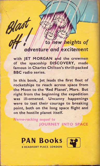
A grand old man of BBC radio productions, Charles Chilton (1917-2013) wrote ‘Journey Into Space’ as a series of radio dramas between 1953-58, subsequently adapting them into a trilogy of novels, published in Pan between ’58 and ’62. See the above wiki links for as much information as you could possibly wish to know on these subjects.
Though he has a nice clear signature, Google turns up nothing on cover artist Glenn Stewert.
(1968, cover designer unknown)
The better looking entries in the Horror Stories series are probably about as close to ‘iconic’ cool as Pan paperbacks get, and this is definitely one of my favourites. As is often the case with Pan - great fonts.
(1952, cover artist unknown)
I don’t know anything about this one, and can’t read the artist’s signature, but it’s quite lovely isn’t it? Quite abstract by Pan standards.
(1957, cover by Rex Archer)
With no slight intended to ‘Rex’, you’d think they’d have gone with something a bit more.. classy for Hemingway, but what the hey, I like it. Kind of reminds me of an old Indian movie poster or something. As someone appears to written above the title of my much abused copy: ‘potent’.
(1962, cover by ‘Michel’?)
Because you can’t get to the end of a cover art gallery without a bit of Erle Stanley. This isn’t one of the more lively crime covers in my collection, but for connoisseurs might like to note that the spine is killer - really jumps off the shelf.
And finally, scribbled on back inside cover of ‘The Case of the Runaway Corpse’, we find one of those curious oddities that occasionally turn up to hint at a book’s past life – in this case, rough notes for a letter decrying the excessive expense and loudness of a new church organ, apparently.


1 comment:
A 'mind-feel" that no tablet, Nook and ipad can replicate.
Post a Comment